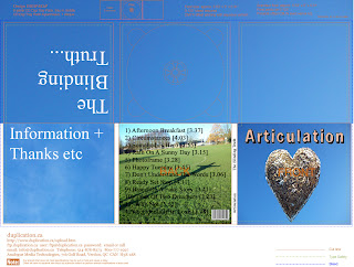
This is a very rough version mock up for the C.D Pack. The first thing I can pick up from doing it is that we need more photos to work with, because I found myself having to use the same photos over and over. So we need to get out with a camera and take some more photos. I like the background being used for this version, because it focuses on the light-heartedness of the brand image, but I don't like the fact that there isn't much image variety on it. I would still like it to be simple, but it needs more to it than this version.

Mark, the green seems a tad harsh when next to the blue panes. I agree the pack seems too simple, perhaps a more engaging panorama might suit this better.
ReplyDelete