Wednesday, 15 December 2010
Accidentally In Love Final Edit
This is the final draft for our music video. Enjoy, comment and leave feedback!
Tuesday, 14 December 2010


Final Version Of C.D Cover And Poster


This is my final version of my C.D cover and poster. I decided to fill in the lettrers with blue on the poster that were difficult to read in the end, but left the rest as it was. As for the C.D cover, I used the shared image of the sun for both the first panel on my C.D cover and poster, but it was adjusted from the draft to a lighter colour, so that it all fitted in better. I also changed the production information, using some real examples as help.
Monday, 13 December 2010
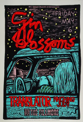
Draft Two Of The Band Poster

I much prefer this version to my original effort, and It has all the conventions this time. The main problem with this though is that the writing is a bit hard to read, so a change of colour is required for the final version.
Wednesday, 8 December 2010
Working On The Digipack

Ancillary Draft Feedback
Do your C.D covers and posters match?
The main picture and the fonts on the front of the C.D cover matches the poster.
Does your work reflect your genre of music?
In my opinion my work does reflect our genre of music.
Have you produced an advert? Are all conventions apparent?
I have produced an advert and all the conventions are apparant but some things need improvements such as the production information where I need to actually write something. Also some layouts might need changing.
Have you produced a digipack?
I have produced a digipack but it just needs improving.
Tuesday, 7 December 2010
Ancillary Draft Feedback
A change to the original plan. All students must now submit seperate ancillary products to ensure equal input, fairness and equal assessment chances.
Do your C.D covers and posters match?
The main picture of the C.D cover and posters match, but there is an issue with the fonts matching. Also, the covers need some work to bring the lighting to a similar level.
Does your work reflect your genre of music?
My picture needs to be a bit lighter to reflect the genre better. For the picture though, I was aiming more at the title of the album, rather than focusing on the band themselves.
Have you produced an advert? Are all conventions apparent?
On my effort, all the conventions feature on the C.D cover and poster. However, there is an attention to detail that needs improving, such as the layout of the tracklist, and the content of the production information paragraph.
Have you produced a digipack?
As previously stated, all conventions have been completed, it's just lacking in the detail.
Friday, 3 December 2010
First Draft Completed Version


On the album cover I have used the same sky background for the three panels. The text on it is easy to read and it gives a consistent look. I used the blinding sun picture because it refers to the album name, 'The Blinding Truth'.
The poster is based on my original idea for the album cover with additional information. I like it because it is a simple layout and all the text is clear and easy to read.
I like the visual impact that this will have.
We have to decide between Marks and mine for the final draft. We might ask other peoples opinions which poster and cover they think would be a better fit for our genre.
First Draft Completed Version


Wednesday, 1 December 2010
C.D. Cover Examples


This the album cover for the Avalanches, Since I Left You. I think this is good but it is not quite the type of thing that we would do because it is too busy and too dark and we want something brighter and more light hearted.
I like the way that the ship is spread out across all three panels inside the c.d. I might use this idea in my album cover.
C.D Cover Examples


This is the album cover for the Kings Of Leon, Youth & Young Manhood. I think that it's a bit of a boring album cover, and personally wouldn't like to try and do something similar. In the bottom picture on here, I do like the way the middle panel has a different image to the other two, whilst still fitting the colour pallet. As can be seen from our own attempts at creating an album cover, this is something we are doing.
Tuesday, 30 November 2010
Band Posters Mock Up Two

This is an example of a band poster. I like this because it is quite simple but i think it could have a few more things such as a website or ratings.
This is the updated version with the ratings and a website. I found the stars on google and chose the middle bottom one because it is clearer. I then put it on photoshop and coloured the black part in white so it would just be all white on the poster because it matches the text. I then went on myfonts.com and got the website in the font type I wanted.


Band Poster Mock Up One

This poster is based on one of the album covers we did. I quite like the way that the sun is a symbol that represents the "blinding" part of the album title. Something that would be needed to change is that the writing is hard to read. It might be fine if I just put a black outline around the edge of the writing though. Also it needs some more things on it, such as ratings and website addresses.
Monday, 29 November 2010
Digipack Mock Up Three

Digi Pack Mock Up Two

I liked the top one at first but then afterwards I thought it looked a bit plain and boring. We want something simple but not too simple. So I decided to change the inside parts to the sun picture. I like this one better than the one above because it is simple but not too much. One problem is not knowing what to write on the inside parts.

Digipack Mock Up One

This is a very rough version mock up for the C.D Pack. The first thing I can pick up from doing it is that we need more photos to work with, because I found myself having to use the same photos over and over. So we need to get out with a camera and take some more photos. I like the background being used for this version, because it focuses on the light-heartedness of the brand image, but I don't like the fact that there isn't much image variety on it. I would still like it to be simple, but it needs more to it than this version.
Sunday, 28 November 2010
Filming All Of The Shots That Needed Changing
On wednesday 24th, we managed to film all the shots that we needed except for the shots of Jack and Paul running out of their houses because we had problems of getting to their houses before it went dark. So, we decided to leave those shots out and just have the shot of Mark running out of his house.
After further consideration, we decided that we didn't need the extra leaving the house shots. Also due to time constraints and lack of light, it would have been a struggle to film them regardless.
After further consideration, we decided that we didn't need the extra leaving the house shots. Also due to time constraints and lack of light, it would have been a struggle to film them regardless.
Wednesday, 24 November 2010
Filming- Retakes
Today at lunchtime, the plan is to re-shoot all the shots that Jack and Paul are wearing the incorrect clothes in, and to do the flower sequence as well. Everyone has the clothes with them required, we have a camera booked out from the library, and we all (bar Alison) have a free the lesson before hand, so we may get an extra start before then.
This is our last chance to film before the deadline, so its vital we get it right. We have learnt from our previous mistakes though, and we should be fine. The deadline is on friday, so after this filming its just all about editing.
This is our last chance to film before the deadline, so its vital we get it right. We have learnt from our previous mistakes though, and we should be fine. The deadline is on friday, so after this filming its just all about editing.
Filming Evaluation
These are of Mark and I filming the performance shots.


When everyone got to my house Mark and I decided that we should do all the band members together shots. Then we did individual shots of each band member. As you can see in one of the above pictures the window is open so that I am able to get my head behind the camera to see what I am filming, to make sure everyone was in the shot.
When we were filming the performance shots we had the music 'Accidentally in Love' on in the background so the band members could make their performances look realistic. I used my phone for this, which was loud enough for the small room we were in and the sound quality was good enough for our purposes.
It was dark outside when we were filming so we had to use an artificial light. Then we decided to have extra lighting in the room to make the band members stand out more. We found two desk lights We put one behind Paul, (drummer), and one behind Jack and Mark (guitarist and vocalist). When we used different camera angles we had to move the lighting around to keep everybody lit consistently.
On the whole, we were very pleased with how successfully the filming went this evening. We got through all of the performance shots quite quickly, thanks to the idea of using two cameras at once, to get two shots in one go, which sped up the process. We had one camera on a tripod, and one camera without, so we had a mix of shots types, and we made sure there were plenty of angles, and focusing on different aspects of the performance. Also we thankfully didn't make any continuity mistakes like the last time.
One problem we did have was Jacks guitar strap came undone when we were filming which meant we filmed the shot several times.
Tuesday, 23 November 2010
Band Poster Research

These are two posters that are from similar artists, and as well as the Counting Crows. All of them are based on the art from the album covers themselves, and feature such generic conventions as title, artist name and extra information like the release date.
Band posters always have the name of the band and the album name, the date of when the album is coming out and the album picture.
I like both of these album posters but I think Mark and I will go for something simpler and one that doesn't have the band members on it seeing as our c.d cover doesn't.
Digipack Template
http://www.duplication.ca/printspecs/digipack.htm

This is the website we were told to get our C.D pack template from. It gives us the option of 4 panels, 6 panels, and where we put the actual C.D (on the inside, the side, etc). We will be using the 6 panel template, and we shall try a variety of C.D positions.

This is the website we were told to get our C.D pack template from. It gives us the option of 4 panels, 6 panels, and where we put the actual C.D (on the inside, the side, etc). We will be using the 6 panel template, and we shall try a variety of C.D positions.
Band Posters Research


Monday, 22 November 2010
Shots That Need Changing
This a list of all the shots that need changing:
- Jack running out of the house because he is wearing incorrect clothes.
- Paul running out of the house because he is wearing incorrect clothes.
- All of the band meet up because two of the band members were wearing the wrong clothes.
- All three looking at Alison as she walks by because two of the band members were wearing the wrong clothes.
- All of the flower shots actually need filming.
- Jacks waving scene becasue he is wearing incorrect clothes.
- Get rid of Jacks performance shot by the river because he is wearing incorrect clothes.
- Get rid of the one shot that Paul is playing the drums because he is wearing incorrect clothes.
- Change all of the phone shots because of incorrect clothing.
- All of second wave scene needs filming.
- All of end scenes film.
Filming Plan
The final deadline is on friday for our finished music video. At the moment, it looks rather tight for time, so we are going to have to resort to filming at lunchtimes, because by the time we get home after school its almost dark.

The weather looks alright for tomorrow and wednesday, but today isn't an option. Catherine is currently making a list of shots we need to redo (see later post), and we will book 2 cameras to make it so we can film from 2 angles at once, to speed up the process.
Sunday, 21 November 2010
Continuity Mistakes
On the 18th when we did the performance shots we made a big mistake. The last shot we filmed was of Mark doing the song on his own. When it had finished we realised Mark was wearing the wrong clothes and so we tried to refilm it with the right clothes but the battery died in the camera and Mark had forgotten the charger. We have arranged to refilm this scene on Tuesday 23rd after school. It shouldn't take long to do this as we know exactly what we have to do.
Saturday, 20 November 2010
Performance Location

In the original plan there was going to be a shot of each band member doing their performance in different locations. This is the room that we started off with when we were just filming the drummer. But we decided to change the plan and put all the band members in together. We had to move all the furniture out of the room except for the bed which we moved further away from the window so then all the band members could fit in. This took quite a long time to do but the shots we got were worth it in the end except for the mistake! (see above post).
This is what the room looked like after we moved everything. We managed to squeeze everyone into the space created even when all bans members were in the same shot.

Thursday, 18 November 2010
Plan For Today
From an earlier post I said I was busy all this week but things changed. So today at 4.20pm, Mark, Jack and Paul are coming round my house to refilm all the performance scenes for our music video. We have drums, guitar and lip syncing shots to film, and we need to do more than we did last time we filmed. We are having all of the members of the band in the same location as well, unlike our previous edit where everyone was in different places.
Songs To Put On Our Album
These are all the songs we have decided to name for our album. All of them have been made up, so no copyright issues are applicable. The durations are indicated by [-.--].
1) Afternoon Breakfast [3.37]
2) Circumstances [4.03]
3) Somebody's Hero [2.55]
4) Rain On A Sunny Day [3.15]
5) Photoframe [3.28]
6) Happy Tuesday [3.45]
7) Don't Understand The Words [3.06]
8) Ready Set Stop [4.11]
9) Based On A Fake Story [3.41]
10) Tales Of Two Dreamers [3.23]
11) Why Not [3.52]
12) Accidentally In Love [3.08]
Whilst creating this list, I tried to keep in line with various album related conventions. Using the duration of Accidentally In Love, I tried to keep all the durations to a similar length, also considering that this genre rarely has songs over the length of 4.30 minutes. The amount of songs on average on an album like this is normally around the 12-13 mark.
In terms of the actual song titles themselves, the reoccuring theme is of doing things a bit differently. It's about finding your place in the world, and being happy with who you are as a person.
Tuesday, 16 November 2010
Album Names Considerations
These are the albums names used by the Counting Crows over the years. All of them have a rather abstract sound to them, and could also be described as alternative and thoughtful. The common themes seem to be of hardships and working through them.
-August and Everything After
-Recovering the Satellites
-This Desert Life
-Hard Candy
-Saturday Nights & Sunday Mornings
This is obviously a route that it would make sense for us to go down when naming the album our video is part of. Here are some ideas for the name that we thought of:
- The Fantastic Sunrise
- Going Up
- Tales Of Two Dreamers
- The Blinding Truth
- Carry Me Away
Overall, people we asked for their opinions seemed to prefer "Tales Of Two Dreamers" and "The Blinding Truth". The other titles, whilst fitting to the song itself, don't follow the conventions of the rest of the genre. "The Blinding Truth" eventually won out, due to the fact it has a relevance to our song, and follows the pattern set by the previous Counting Crows albums. Whilst we understand we aren't just copying the original band, it makes sense to follow a similar band image.
Monday, 15 November 2010
Album Cover Mock-Up Version

This is another idea of a front cover that we liked. I like the heart made of wood chipping on the bright background of sky because it makes it stand out. I also like the font type because it stands out.

Here is another variation of this album cover. This one includes the album title that we decided on (see other post).
I like both fonts which I picked out when browsing through MyFonts. com.
I like both fonts which I picked out when browsing through MyFonts. com.
Both of these ideas are the simple styles that we are looking for. There are lots of examples of album covers with this style. For example, Tubularbells by Mike Oldfield and Folie à deux by Fall Out Boy.


Filming- Retakes
On Saturday I refilmed the waving scene and the ice cream scene because the last time Jack and Paul weren't wearing the appropriate clothes but this time they were wearing jumpers like Marks. We couldn't do any more filming because Mark was in London and most of the music video has him in it.
I am busy all this week so Mark is going to have to try to do the filming without me.
I am busy all this week so Mark is going to have to try to do the filming without me.
Friday, 12 November 2010
More Photoshop Experimenting


This is just an example of the kind of route we are going down for our digi pack pictures. We have pretty much decided on the style of picture we want (a bright picture, probably something silohetted against the sun). The font is just a style I happened across and liked as I was bringing myself up to date with Photoshop.
Wednesday, 10 November 2010
Ideas For Our C.D Cover
These are a variety of shot types that we thought would be good for our CD cover.
 Here we decided to take a picture of Marks shadow because we thought it could be a good C.D front cover. We were messing about trying to find unusual images because the counting crows album covers have unusual images on them and so we were trying to use those images as inspiration for our C.D cover. When I took the picture I thought that it was a good idea but on reflection, having looked at it again, it doesn't quite fit the style that we wanted.
 This is Mark making the heart shaped sculpture. We first made the sculpture out of dark wood chippings but when we took a picture it didn't really stand out. So then we put some lighter wood chippings round the outside as a border. This made the whole sculpture really stand out.


This image is one that we might mess about with in photoshop. I like the effect that the camera has come up with.

I quite like the idea of using this as the background for our album cover.

I took this photo when I was on holiday and I thought it would be a good picture for our digi pack. I like the way the camera has made the sun look different and the way it has made the image look grey instead of the usual blue.
 Here we decided to take a picture of Marks shadow because we thought it could be a good C.D front cover. We were messing about trying to find unusual images because the counting crows album covers have unusual images on them and so we were trying to use those images as inspiration for our C.D cover. When I took the picture I thought that it was a good idea but on reflection, having looked at it again, it doesn't quite fit the style that we wanted.
  This is Mark making the heart shaped sculpture. We first made the sculpture out of dark wood chippings but when we took a picture it didn't really stand out. So then we put some lighter wood chippings round the outside as a border. This made the whole sculpture really stand out.
Here's one of the pictures that we took to see if it looked alright or not. We decided we really liked the picture. We chose the heart sign because it connotes love. I think this is ideal becasue it goes with the song title 'Accidentally in Love'. Our target audience will relate to the heart as a sign of love because it is a familiar connotation.
We were experimenting with taking shots of the sky and the sun. We took a lot of pictures but these four were the ones that we thought looked the best. We thought that these could be the background on the album cover or the actual cover itself. Again we were trying to get unusual images as per the counting crows album covers.

We were experimenting with taking shots of the sky and the sun. We took a lot of pictures but these four were the ones that we thought looked the best. We thought that these could be the background on the album cover or the actual cover itself. Again we were trying to get unusual images as per the counting crows album covers.
The above image was spoilt by the climbing frame at the bottom. Just the sun, the trees and the sky would have made a better image.


I quite like the idea of using this as the background for our album cover.

Subscribe to:
Posts (Atom)